onsdag 23 oktober 2013

The Larmen.com Guide to Italian Coffee - work continues

After listening to people who have used the Coffee Guide I decided to make a few changes. In a regular process this would of course have been tested in-house, before the application was uploaded to Google Play. When I run into a friend or acquaintance it's easier to just direct them to the Google Play store though, so it very much encourages spontaneous user studies.

One major point of user complaint was that the view is erratic in where it places the headline of the coffee type in relation to the content. Often times, the headline (coffee type, e.g. Cappuccino) gets hidden above the screen, and you get transported to the middle of the content instead. This seems to be due to the operating system not knowing the size of a particular view before scrolling to it. I've tried to remedy this by using the built-in system method smoothScrollTo(), and sending it to the headlines position in the view. This did unfortunately help in any significant way, so I'm going to call in support from a friend on this issue.


 The initial view. Clicking on Cappuccino sends me to the view below.

 The headline and content are both visible. Scrolling down a bit and clicking on the item Caffè Latte gets the below view.

The headline of the coffee type is not visible.

Secondly, it turns out that the colors in the image are not as clear on the devices as I would have hoped when creating the assets. The blue color we chose for water for instance is too bright, and kind of melds together with the cup color. The same thing goes for the different shades of milky white.

What I wanted to achieve with the application was a navigational flow where the user would feel encouraged to explore the different alternatives. This goal has only partly been achieved, I think partly due to the issues mentioned above.

Mobile website make-over


Over the last few days I've been reading Mobile Usability, by Nielsen and Budiu. This has led me to finally get kicking with a mobile redesign of my site. When I first designed it, I wanted to have a quick-and-dirty site, aimed mainly toward visitors on desktop computers. The mobile website was, as in many other cases, an afterthought, which is painfully evident.


My website on an iPhone 4S

I've divided up my initial critique into three points:
1) There's too much vertical scrolling going on. The first view just contains an image of me until scrolling down. The situation is even worse with some of the subsections, with Where's Malibu standing out as especially aggregeous. The image resolutions and layout, together with the large amount of text about each project, definitely lead to a sub-par experience.
2) The menu situation is not very good for visitors not familiar with my projects (and who really is except me?). Why would anyone consider visiting any of the links? This shows that just making separate CSS for mobile does not get the job done, as you can't explore in the same way. The user cost of clicking the "wrong" item in the list is huge (in the form of a bunch of vertical scrolling, or taking a chance on another menu item).
3) A common problem across platforms is the lack of visible and understandable contact information.

Follow the progress of the project here, or straight on the website itself from your mobile device.

torsdag 17 oktober 2013

The Larmen.com Guide to Italian Coffee, version 1.1

(UPDATE) Version 1.0 is now live on the Google Play store, via this link: https://play.google.com/store/apps/details?id=com.larmen.coffeeguide

After digging around the Google Play store, I hope that changing some details in there will make version 1.0 show up later today. If you're anxious, search the store for Larmendotcom, and it should show up together with our other application Where's Malibu. I'll update the post here when the app is up in the store.

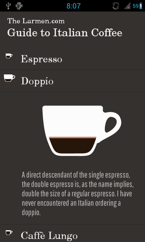
In the meantime I've managed to do some user testing and found some valuable pieces of feedback. One thing that I noticed was that, as I've mentioned before, the starting page didn't work at all. Since I didn't want to replace that with placeholder content, I instead reworked the navigational structure. The view now consists of a list with clikable items. When an item is clicked, the item expands to reveal the content beneath. The whole area is then clickable to close the item again, or you can just click on another item to open that, and close the former (a behavior that seemed expected in my tests).


Alternative color scheme test. This was experienced as less legible, and is in my opinion not as elegant.

The old colour scheme, but with the new layout. Feedback from the tests indicate that perhaps a loading screen or something would feel in place the first time you run the application, as the information was experienced as very "in your face", and a bit overwhelming.

The same layout on a 1920x1080 screen. Following the rythm guidelines in Android, the elements will appear the same size (48dp) on all different screen densities and sizes.

This new version (version 1.1) is downloadable from here! Just as last time, the easiest way to install is to click the link on your phone (make sure you allow for installation from Unknown sources in your phone Settings). If you have any trouble, please let me know at http://twitter.com/larmendotcom. If you've tested any of the versions, please send feedback as well via Twitter!

tisdag 15 oktober 2013

The Larmen.com Italian Coffee Guide, further updates

No news about the Google Play situation, so I'll just keep posting updates here instead.
Some smaller adjustments made since last time: the typeface for the coffee descriptions was adjusted, a divider line was added to make the detailed coffee view more coherent, and everything was put inside of a scrollview. I was also experimenting with a frame around the descriptive text, which didn't work out at all. The final result is screenshot at the bottom below. I believe that the text body continuing below the screen edge should be enough to indicate the scrollable nature of the view.


Ideally I'd like to have another version of the application developed and testable before deciding which one gets to be the "final" one, with the navigational structure mentioned in my last blog post. To get there I have tested to different approaches, each with their own set of drawbacks: the first idea was to utilize the built-in ExpandableListView class in Android, and have each Header (coffe type) item have one child (their descriptive text). Since that setup is built more for a categorizing I came into some complications, which led me to the second approach of dynamically hiding and showing content in a regular ListView.
More to come on that..!

lördag 12 oktober 2013

The Larmen.com Italian Coffee Guide, Google Play update

For some reason the application is not up on the Google Play market yet, despite it being set to status "Published" in the developer console. In the meantime you can download it from my Dropbox via this link. The easiest way to install the app is to enable "Install from unknown sources" in your phone's settings, and then visiting the aformentioned link via your phone. Alternatively you can of course message the link to your phone via the messaging service of your choice. Nerds like me will just push it via adb shell :)

On a more positive note, I today had the chance to perform some observation of first-time users of the app. One thing that's apparent is that it is not at all clear enough that the starting screen coffee cups are just there for illustrative purposes. This leads to maybe 15-20 seconds of pointless tapping on the screen before heading up to the upper left corner to get to the menu. This will be the first thing in the order of business for the next version.
As I see it I now have some alternatives, in the order of time commitment from quickest to slowest:
a) Make the coffee cups to links to actual content (creating a number of other problems)
b) Re-design static starting page to more clearly indicate that it's not interactive (waste of space perhaps?)
c) Displaying something else on there (my original plan was to perhaps have photos or interviews, etc.)
d) Redesign the whole navigational structure (which I'm not very happy with), and design something that makes sense in just ONE layout, something I practiced while sketching a media player for an internship application (see below)


Testing and reworking will continue throughout the coming week, keep your eyes peeled!

torsdag 10 oktober 2013

The Larmen.com Italian Coffee Guide, part 4

Today was spent in crunch mode together with Filip, and it certainly payed off in the end: The Larmen.com Guide to Italian Coffee is now uploaded to the Google Play Store! It should be up in a few more hours, and I'll update this post with the link as soon as I can see that it's live.


We still have a long //TODO-list, and a potential navigational re-design in the works, so stay tuned!