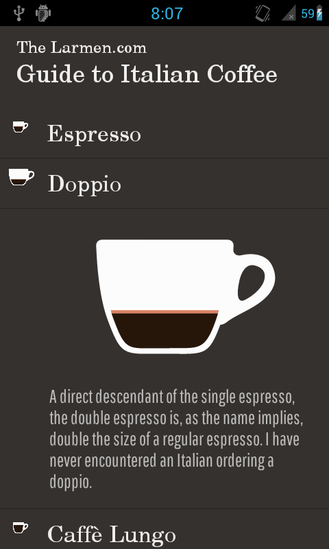
The latest version of the Coffee Guide is now up on the Google Play store! Typeface change and two more coffee types are now live: Caffè Mocha and Caffè con Panna.
When checking out the developer console I noticed I've gotten three downloads in Iran, and quite a few more outside of Sweden, which is really cool!
Visar inlägg med etikett android. Visa alla inlägg
onsdag 18 december 2013
söndag 15 december 2013
Coffee Guide mini-redesign
When I first outlined the sketches for The Guide to Italian Coffee, I wanted the feeling to be a little notebook that you kept in your pocket. The typeface in the logo was supposed to reflect this with an old-school serifed typeface.
Since then I've become more and more unhappy with the look of the application, and after being inspired by the creators of Pocket Casts on the Iterate podcast (via Android Central), I wanted to explore using Roboto as the typeface for all parts of the application. Throughout this morning I have tested different font weights and sizes to get the right feeling in the application, as well as been amazed that the Roboto typeface, after what I can tell, still is not included in the Android SDK, and has to be added manually.
I also did a tweak to the left margin for the descriptive text, which I found didn't work out at all.
On the above image, the current Play Store version is to the left, and the adjusted version to the right. I'm now waiting to write up and make assets for two more types of coffee (Caffè Mocha and Caffè con Panna for those who are curious), and then I'm ready to upload a new version.
It's really interesting to see the two screens side by side like this, and the complete difference in colour reproduction: it makes me wish I hade more cash so I could get a bunch more devices to test on.
Since then I've become more and more unhappy with the look of the application, and after being inspired by the creators of Pocket Casts on the Iterate podcast (via Android Central), I wanted to explore using Roboto as the typeface for all parts of the application. Throughout this morning I have tested different font weights and sizes to get the right feeling in the application, as well as been amazed that the Roboto typeface, after what I can tell, still is not included in the Android SDK, and has to be added manually.
I also did a tweak to the left margin for the descriptive text, which I found didn't work out at all.
On the above image, the current Play Store version is to the left, and the adjusted version to the right. I'm now waiting to write up and make assets for two more types of coffee (Caffè Mocha and Caffè con Panna for those who are curious), and then I'm ready to upload a new version.
It's really interesting to see the two screens side by side like this, and the complete difference in colour reproduction: it makes me wish I hade more cash so I could get a bunch more devices to test on.
fredag 1 november 2013
Status update
Blogging slows down when work picks up, but I still want to share some status updates.
Ball Game
The ball game prototype is now abandoned by us, as the game engine we used didn't handle bouncing(!) very well. This came up as one of the main criticisms during play-testing. Instead of moving on to another engine we decided to move onto other projects. I still think this was a interesting concept in its simplicity though, and would like to come back to it one day, but for mobile.
Coffee Guide
I did some updates to the application during the week - one of the things that I was least happy with after the last layout change was the bad user experience on larger screens like tablets. The application has now been updated with a tablet interface, similar to the first version of the app (with a sidemenu for picking coffee type, and a main view to the right for showing information).

Mobile website redesign
This has been ongoing throughout the week, but with no major overhauls, just a lot of smaller adjustments and fixes. The devil really is in the details!
NEW PROJECT!
We decided that, after abandoning the ball game idea, we wanted our next project to be for mobile devices, mainly due to the fact that we both think it's the most fun and interesting area to work within. One of my main draws toward mobile is their context awareness - you really need to design for so many varying use-contexts. You can also let the user and context influence the software in a totally different way than on our other digital artefacts.
Thomas mentioned his fascination with the simplicity of the new spirit-level in the iOS7 compass app, something I also have appreciated. After some discussion we decided to do something with a similar - take a simple data value, but present it in an elegant and interesting way. The data of choice fell on altitude above sea level: it's a value that is easily comprehended, but it does not at all have a significant place in most people's lives. Can we make something that can make this topographical property interesting to people?
Today has been spent sketching different ways to convey altitude in relation to a smartphone, but also to dissect the different components that are involved when actually being at a certain altitude, e.g. the earth, topographical features, the person itself, but also how you hold the phone in relation to the earth's surface.
We think we have dialled the design down to a couple of alternatives, so now comes the next problem. How do we test this successfully in a paper prototype-state? Is it even meaningful? Do you care about altitudes that you've never visited, if you just get them served to you in a test setting?
Our instant feeling is that we'll perhaps need to make this a longer test period, with a digital prototype, so that people can look at actual values, and to test how close we can get to the elegance of the aforementioned spirit-level app. We see this as a rarely used application, that mostly will be used when you're at an exceptional topographical feature (e.g. the top of a mountain or bottom of a quarry), so the testing procedure will need to allow for that as well in some fashion.
See you again on Monday!
Ball Game
The ball game prototype is now abandoned by us, as the game engine we used didn't handle bouncing(!) very well. This came up as one of the main criticisms during play-testing. Instead of moving on to another engine we decided to move onto other projects. I still think this was a interesting concept in its simplicity though, and would like to come back to it one day, but for mobile.
Coffee Guide
I did some updates to the application during the week - one of the things that I was least happy with after the last layout change was the bad user experience on larger screens like tablets. The application has now been updated with a tablet interface, similar to the first version of the app (with a sidemenu for picking coffee type, and a main view to the right for showing information).


Screenshots of the Coffe Guide running on Nexus 7 (2012) hardware (sorry for the messed up layout)
Mobile website redesign
This has been ongoing throughout the week, but with no major overhauls, just a lot of smaller adjustments and fixes. The devil really is in the details!
NEW PROJECT!
We decided that, after abandoning the ball game idea, we wanted our next project to be for mobile devices, mainly due to the fact that we both think it's the most fun and interesting area to work within. One of my main draws toward mobile is their context awareness - you really need to design for so many varying use-contexts. You can also let the user and context influence the software in a totally different way than on our other digital artefacts.
Thomas mentioned his fascination with the simplicity of the new spirit-level in the iOS7 compass app, something I also have appreciated. After some discussion we decided to do something with a similar - take a simple data value, but present it in an elegant and interesting way. The data of choice fell on altitude above sea level: it's a value that is easily comprehended, but it does not at all have a significant place in most people's lives. Can we make something that can make this topographical property interesting to people?
Today has been spent sketching different ways to convey altitude in relation to a smartphone, but also to dissect the different components that are involved when actually being at a certain altitude, e.g. the earth, topographical features, the person itself, but also how you hold the phone in relation to the earth's surface.
One of many pages of sketching from this morning
We think we have dialled the design down to a couple of alternatives, so now comes the next problem. How do we test this successfully in a paper prototype-state? Is it even meaningful? Do you care about altitudes that you've never visited, if you just get them served to you in a test setting?
Our instant feeling is that we'll perhaps need to make this a longer test period, with a digital prototype, so that people can look at actual values, and to test how close we can get to the elegance of the aforementioned spirit-level app. We see this as a rarely used application, that mostly will be used when you're at an exceptional topographical feature (e.g. the top of a mountain or bottom of a quarry), so the testing procedure will need to allow for that as well in some fashion.
See you again on Monday!
Etiketter:
android
,
bollspel
,
coffee
,
game design
,
mobile
,
web design
fredag 18 oktober 2013
The Larmen.com Guide to Italian Coffee, version 1.1 - It's LIVE!
As the headline indicates, we're live with version 1.1. Please check it out via http://play.google.com/store/apps/details?id=com.larmen.coffeeguide!
torsdag 17 oktober 2013
The Larmen.com Guide to Italian Coffee, version 1.1
(UPDATE) Version 1.0 is now live on the Google Play store, via this link: https://play.google.com/store/apps/details?id=com.larmen.coffeeguide
After digging around the Google Play store, I hope that changing some details in there will make version 1.0 show up later today. If you're anxious, search the store for Larmendotcom, and it should show up together with our other application Where's Malibu. I'll update the post here when the app is up in the store.
In the meantime I've managed to do some user testing and found some valuable pieces of feedback. One thing that I noticed was that, as I've mentioned before, the starting page didn't work at all. Since I didn't want to replace that with placeholder content, I instead reworked the navigational structure. The view now consists of a list with clikable items. When an item is clicked, the item expands to reveal the content beneath. The whole area is then clickable to close the item again, or you can just click on another item to open that, and close the former (a behavior that seemed expected in my tests).
This new version (version 1.1) is downloadable from here! Just as last time, the easiest way to install is to click the link on your phone (make sure you allow for installation from Unknown sources in your phone Settings). If you have any trouble, please let me know at http://twitter.com/larmendotcom. If you've tested any of the versions, please send feedback as well via Twitter!
After digging around the Google Play store, I hope that changing some details in there will make version 1.0 show up later today. If you're anxious, search the store for Larmendotcom, and it should show up together with our other application Where's Malibu. I'll update the post here when the app is up in the store.
In the meantime I've managed to do some user testing and found some valuable pieces of feedback. One thing that I noticed was that, as I've mentioned before, the starting page didn't work at all. Since I didn't want to replace that with placeholder content, I instead reworked the navigational structure. The view now consists of a list with clikable items. When an item is clicked, the item expands to reveal the content beneath. The whole area is then clickable to close the item again, or you can just click on another item to open that, and close the former (a behavior that seemed expected in my tests).
Alternative color scheme test. This was experienced as less legible, and is in my opinion not as elegant.
The old colour scheme, but with the new layout. Feedback from the tests indicate that perhaps a loading screen or something would feel in place the first time you run the application, as the information was experienced as very "in your face", and a bit overwhelming.
The same layout on a 1920x1080 screen. Following the rythm guidelines in Android, the elements will appear the same size (48dp) on all different screen densities and sizes.
This new version (version 1.1) is downloadable from here! Just as last time, the easiest way to install is to click the link on your phone (make sure you allow for installation from Unknown sources in your phone Settings). If you have any trouble, please let me know at http://twitter.com/larmendotcom. If you've tested any of the versions, please send feedback as well via Twitter!
tisdag 15 oktober 2013
The Larmen.com Italian Coffee Guide, further updates
No news about the Google Play situation, so I'll just keep posting updates here instead.
Some smaller adjustments made since last time: the typeface for the coffee descriptions was adjusted, a divider line was added to make the detailed coffee view more coherent, and everything was put inside of a scrollview. I was also experimenting with a frame around the descriptive text, which didn't work out at all. The final result is screenshot at the bottom below. I believe that the text body continuing below the screen edge should be enough to indicate the scrollable nature of the view.
Ideally I'd like to have another version of the application developed and testable before deciding which one gets to be the "final" one, with the navigational structure mentioned in my last blog post. To get there I have tested to different approaches, each with their own set of drawbacks: the first idea was to utilize the built-in ExpandableListView class in Android, and have each Header (coffe type) item have one child (their descriptive text). Since that setup is built more for a categorizing I came into some complications, which led me to the second approach of dynamically hiding and showing content in a regular ListView.
More to come on that..!
Some smaller adjustments made since last time: the typeface for the coffee descriptions was adjusted, a divider line was added to make the detailed coffee view more coherent, and everything was put inside of a scrollview. I was also experimenting with a frame around the descriptive text, which didn't work out at all. The final result is screenshot at the bottom below. I believe that the text body continuing below the screen edge should be enough to indicate the scrollable nature of the view.
Ideally I'd like to have another version of the application developed and testable before deciding which one gets to be the "final" one, with the navigational structure mentioned in my last blog post. To get there I have tested to different approaches, each with their own set of drawbacks: the first idea was to utilize the built-in ExpandableListView class in Android, and have each Header (coffe type) item have one child (their descriptive text). Since that setup is built more for a categorizing I came into some complications, which led me to the second approach of dynamically hiding and showing content in a regular ListView.
More to come on that..!
lördag 12 oktober 2013
The Larmen.com Italian Coffee Guide, Google Play update
For some reason the application is not up on the Google Play market yet, despite it being set to status "Published" in the developer console. In the meantime you can download it from my Dropbox via this link. The easiest way to install the app is to enable "Install from unknown sources" in your phone's settings, and then visiting the aformentioned link via your phone. Alternatively you can of course message the link to your phone via the messaging service of your choice. Nerds like me will just push it via adb shell :)
On a more positive note, I today had the chance to perform some observation of first-time users of the app. One thing that's apparent is that it is not at all clear enough that the starting screen coffee cups are just there for illustrative purposes. This leads to maybe 15-20 seconds of pointless tapping on the screen before heading up to the upper left corner to get to the menu. This will be the first thing in the order of business for the next version.
As I see it I now have some alternatives, in the order of time commitment from quickest to slowest:
a) Make the coffee cups to links to actual content (creating a number of other problems)
b) Re-design static starting page to more clearly indicate that it's not interactive (waste of space perhaps?)
c) Displaying something else on there (my original plan was to perhaps have photos or interviews, etc.)
d) Redesign the whole navigational structure (which I'm not very happy with), and design something that makes sense in just ONE layout, something I practiced while sketching a media player for an internship application (see below)
Testing and reworking will continue throughout the coming week, keep your eyes peeled!
On a more positive note, I today had the chance to perform some observation of first-time users of the app. One thing that's apparent is that it is not at all clear enough that the starting screen coffee cups are just there for illustrative purposes. This leads to maybe 15-20 seconds of pointless tapping on the screen before heading up to the upper left corner to get to the menu. This will be the first thing in the order of business for the next version.
As I see it I now have some alternatives, in the order of time commitment from quickest to slowest:
a) Make the coffee cups to links to actual content (creating a number of other problems)
b) Re-design static starting page to more clearly indicate that it's not interactive (waste of space perhaps?)
c) Displaying something else on there (my original plan was to perhaps have photos or interviews, etc.)
d) Redesign the whole navigational structure (which I'm not very happy with), and design something that makes sense in just ONE layout, something I practiced while sketching a media player for an internship application (see below)
Testing and reworking will continue throughout the coming week, keep your eyes peeled!
torsdag 10 oktober 2013
The Larmen.com Italian Coffee Guide, part 4
Today was spent in crunch mode together with Filip, and it certainly payed off in the end: The Larmen.com Guide to Italian Coffee is now uploaded to the Google Play Store! It should be up in a few more hours, and I'll update this post with the link as soon as I can see that it's live.
We still have a long //TODO-list, and a potential navigational re-design in the works, so stay tuned!
tisdag 8 oktober 2013
The Larmen.com Italian Coffee Guide, part 3
Today work continued with another pass at asset management for the Coffee Guide-application. Inspired by a talk by TAT founder Hampus Jakobsson, who encouraged us to "release, release, release" I've decided to get a working version up on Google Play, before possibly developing and expanding the application.
This is mainly a way to get user feedback. Although late in the process, I hope to get as much constructive feedback as possible. I do realize that getting user feedback this late in the process requires special tools - during my thesis we tested two differing mixed-fi prototypes, and tried to get feedback via comparison. I think I'll go for a similar approach with the Coffee Guide. This also seems to be the most common case in the industry, where most software is iterated upon, not created from scratch.
As per usual, the differing screen sizes and densities prove to be a hassle on Android. Luckily Filip once more jumped in to provide assistance with asset creation, and also whipped up a nifty Photoshop script to down-scale in steps from the largest xxdpi bucket and going lower. As the image indicates I had some emulator fun, testing all the fresh assets.
My ambition is to get the app ready for the Career Days-expo here in Malmö on Friday the 18th of October. Something to show off has to better than nothing, don't you think?
fredag 4 oktober 2013
The Larmen.com Italian Coffee Guide, part 2
Squeezed in some Android fiddling during lunch, and managed to figure out what the layout problems were all about yesterday: if you have an image where the resolution is wider than the screen, it will (for some reason) fill up the whole parent container. Or at least it seems that way. My problems disappeared when shrinking the .png-file to the correct size for my HDPI screen.
I'll keep you posted on further progress (as usual)!
torsdag 3 oktober 2013
The Larmen.com Italian Coffee Guide, introduction
Since the decision to move to a more personal format with the coffee application, I've done som write-ups on the most important coffee types in my opinion. I want to user test the application with side menu navigation before doing any bigger changes, but it seems to me that I might have to go back to the drawing board. There are just too many different types of coffee :) This clutters the menu with a bunch of alternatives all starting with the word Caffè.
In addition to this I'd like a space in the app that maybe in the future can contain some other type of content, like images, reviews, etc.
Work has now been stalled, since I've come across a weird layouting problem in the xml-layout for the fragment that displays the information about the different types of coffee. When moving a ImageView to the top of a vertical linear layout, it takes up the whole screen, instead of using it's assigned property "wrap_content".
When placed at the bottom of the screen, it works just as it should, with first the headline's TextView, then the description's TextView, and then the ImageView (all with layout_height = "wrap_content").
Luckily I've enlisted the help of friend Filip Ivansson to help out with the illustrations for the content. He's now created the base shape for the three different sizes of cups that should cover almost all of the common types we want to add to the app. His work with the espresso can be seen in the photos above.
PS. I'm sorry about the layout of images on this blog, I'm not sure what's up with Blogger's image import settings.
In addition to this I'd like a space in the app that maybe in the future can contain some other type of content, like images, reviews, etc.
Work has now been stalled, since I've come across a weird layouting problem in the xml-layout for the fragment that displays the information about the different types of coffee. When moving a ImageView to the top of a vertical linear layout, it takes up the whole screen, instead of using it's assigned property "wrap_content".
When placed at the bottom of the screen, it works just as it should, with first the headline's TextView, then the description's TextView, and then the ImageView (all with layout_height = "wrap_content").
Luckily I've enlisted the help of friend Filip Ivansson to help out with the illustrations for the content. He's now created the base shape for the three different sizes of cups that should cover almost all of the common types we want to add to the app. His work with the espresso can be seen in the photos above.
PS. I'm sorry about the layout of images on this blog, I'm not sure what's up with Blogger's image import settings.
tisdag 1 oktober 2013
The Hipster's Guide to Italian Coffee - follow up
After one and a half day of working with the coffee guide I realized that I had to always fight an urge to editorialize the content in the application. Instead of fighting it I've now decided to give up, and instead of doing a regular coffee guide, I want the content in the application to be more from my perspective. This also lead to a reconceptualizing of the application to perhaps not only include different types of coffee, but also reviews, interviews with people working in the coffee business, etc.
Apparently this project will now become a bit larger than I initially envisioned, however this new direction actually feels something I'm a lot more passionate about. I'll keep you posted!
torsdag 26 september 2013
The Hipster's Guide to Italian Coffee, intro
For a while now I've wanted to develop a digital guide to Italian coffee (one of my big life passions). I've had the silly word-play title "The Hipster's Guide to the Galaxy" kicking around for a while, and decided that the Italian coffee application could fit under that umbrella.
Real concept development of this idea started last Friday, when I was sketching ideas for how to navigate through all the different types of coffee, and considering the hierarchical structure. Based on experience I gathered during my thesis project (here), I wanted to encourage a exploratory navigation through the application, and probably a flat hierarchical structure.
I realize that this is not a new app-concept, and have already checked out a few of the ones that are available on Google Play. However, those are often pretty utilitarian in their looks, and at least a few of them seem to be aimed more at the home espresso machine owner, than my target group: the trend-sensitive hipster that wants to stump the local super-smug, fixie-riding, arm-tattooed barista.
This left me deciding to go with a side-menu navigation, with a list of the different types of coffee. Since I want the app to be a bit eye-catching, rather than utilitarian, I decided to test out a few different graphical styles. I played around with different illustrations as well, but couldn't really find the tone. In the end I found this inspiring poster on visual.ly called Exceptional Expressions of Espresso, by the Pop Chart Lab, and decided to incorporate that into my prototype, just for mock-up purposes. The idea is to replicate a similar kind of visual language going forward, but with illustrations that are a bit more flat (and of course non-copyright infringing).
Final result after almost two days of work can be seen below:
Real concept development of this idea started last Friday, when I was sketching ideas for how to navigate through all the different types of coffee, and considering the hierarchical structure. Based on experience I gathered during my thesis project (here), I wanted to encourage a exploratory navigation through the application, and probably a flat hierarchical structure.
I realize that this is not a new app-concept, and have already checked out a few of the ones that are available on Google Play. However, those are often pretty utilitarian in their looks, and at least a few of them seem to be aimed more at the home espresso machine owner, than my target group: the trend-sensitive hipster that wants to stump the local super-smug, fixie-riding, arm-tattooed barista.
This left me deciding to go with a side-menu navigation, with a list of the different types of coffee. Since I want the app to be a bit eye-catching, rather than utilitarian, I decided to test out a few different graphical styles. I played around with different illustrations as well, but couldn't really find the tone. In the end I found this inspiring poster on visual.ly called Exceptional Expressions of Espresso, by the Pop Chart Lab, and decided to incorporate that into my prototype, just for mock-up purposes. The idea is to replicate a similar kind of visual language going forward, but with illustrations that are a bit more flat (and of course non-copyright infringing).
Final result after almost two days of work can be seen below:
TODO:
- user test on someone (urgently), something that's difficult when you're home alone developing
- add a bunch of more variations of coffee, and also expand the descriptions
- replace all the "borrowed" material from the coffee poster with my own beautiful Inkscape-products
PS. If you have the IP rights of the poster, and you don't want it featured on this site, drop me a line and I'll remove the images.
Prenumerera på:
Inlägg
(
Atom
)

.jpg)