When checking out the developer console I noticed I've gotten three downloads in Iran, and quite a few more outside of Sweden, which is really cool!

.jpg)


I've divided up my initial critique into three points:
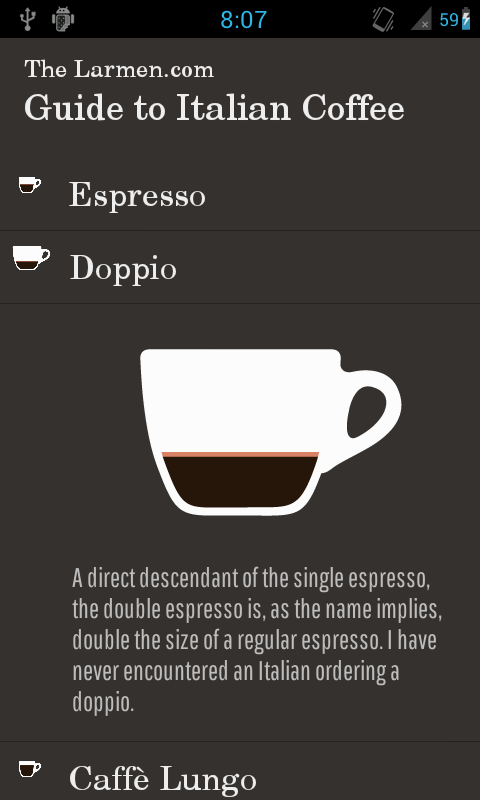
1) There's too much vertical scrolling going on. The first view just contains an image of me until scrolling down. The situation is even worse with some of the subsections, with Where's Malibu standing out as especially aggregeous. The image resolutions and layout, together with the large amount of text about each project, definitely lead to a sub-par experience.
2) The menu situation is not very good for visitors not familiar with my projects (and who really is except me?). Why would anyone consider visiting any of the links? This shows that just making separate CSS for mobile does not get the job done, as you can't explore in the same way. The user cost of clicking the "wrong" item in the list is huge (in the form of a bunch of vertical scrolling, or taking a chance on another menu item).
3) A common problem across platforms is the lack of visible and understandable contact information.